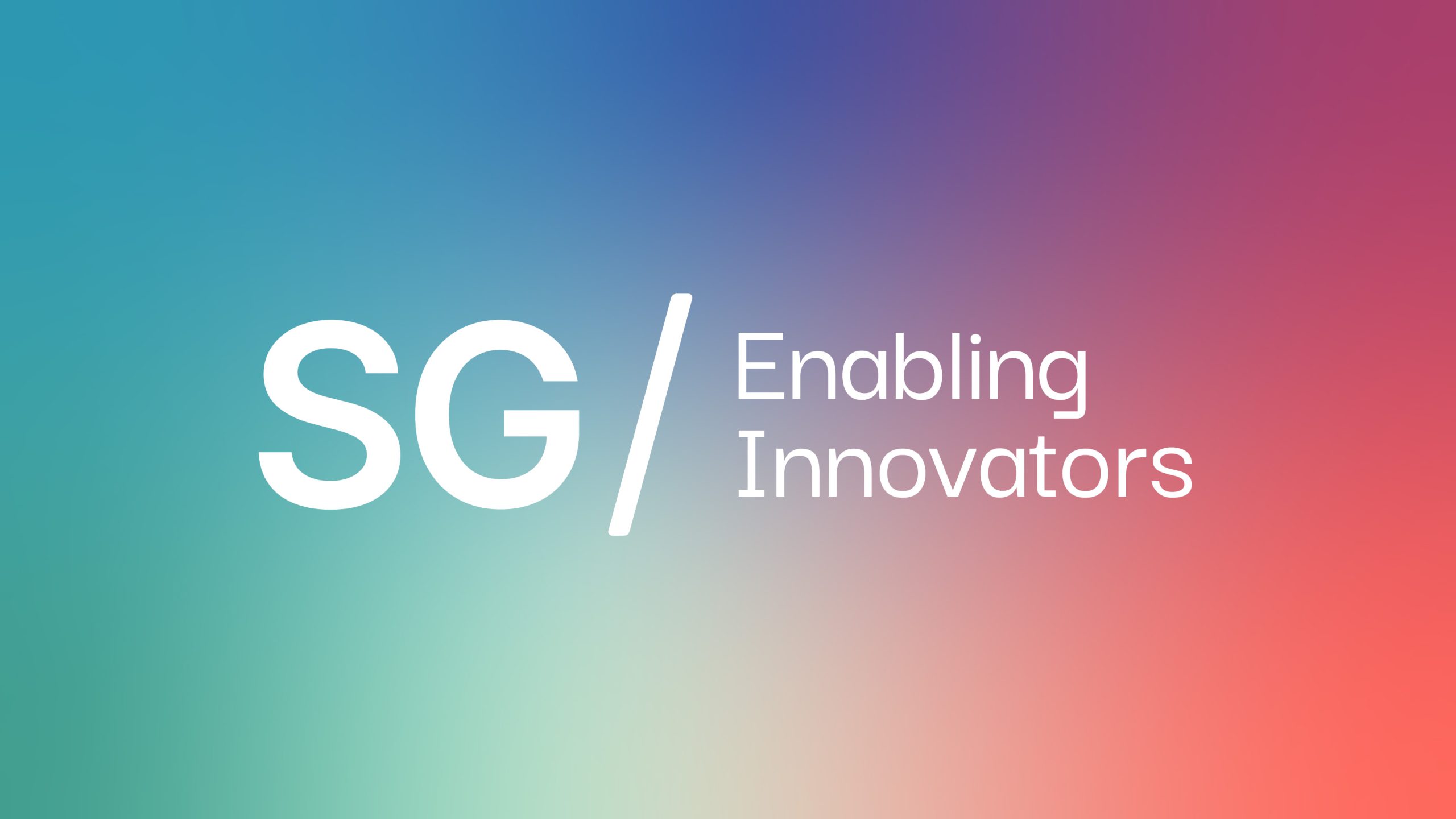
SG Logo with Tagline
Our logo can be used with the tagline positioned to the right. Wherever space allows we should try and use this lock-up.
Always use the official artwork files as they have been setup with specific spacing. Never re-create the files.
SG Logo
The SG logo is a clear and simple representation of our company. The forward slash depicting our openness and enablement of innovation in the IoT space.
Always use the official artwork files as they have been setup with specific spacing. Never re-create the files.
Logo Versions
Wherever possible use the primary logo versions.
The mono versions are to be used when the background does not have enough contrast with the coral colour or printing restricts the amounts of colours.

Clearspace
When positioning the logo or placing elements around please ensure the clearspace guidelines are followed. This will ensure our logo stands out and is not crowded.
The clear space is determined by the height of the ‘G’ cross stoke, indicated by ‘X’.
Minimum size
The logos have all been carefully crafted to read well at all sizes. Minimum sizes have been set to ensure legibility.