Primary Colours
Colour plays a crucial role in our identity. With it, we establish our brands expression and personality.
Use the primary colours on all collateral to ensure we maintain consistency when talking to our audience.
Only use the following colour values in branded materials.
Secondary Colours
Our secondary colour palette is used to compliment the primary colours. They should only be used sparingly to help highlight when more than the primary colours are needed.
Tints
The primary Creative coral and secondary Growth Green and Build Blue can be used as tints.
Tints can be used to create subtle backgrounds on the website and in print.
Gradient
An important part of our colour suite is the SG gradient. The gradient is made from our primary and secondary colour palette.
The gradient is used to bring energy and possibilities to our designs. The gradient depicts our enablement of any IoT solution across all sectors.
Only use the artwork file of the gradient and never re-create it.
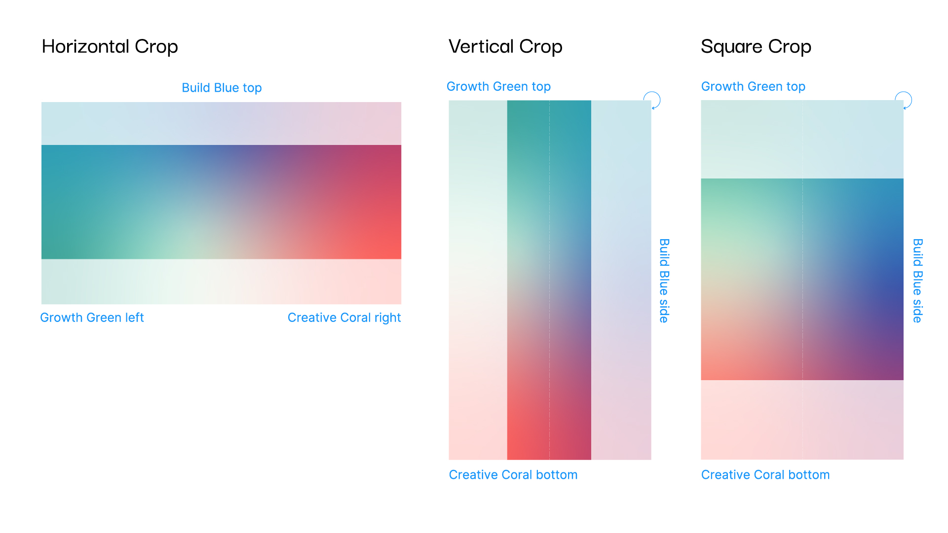
Gradient Crops
To maintain a consistent use of the gradient, crops of the artwork file should be used.
For the vertical and square crop the Gradient is rotate 90 degrees clockwise.
A gradient fill should no be used with in applications on solid fills.
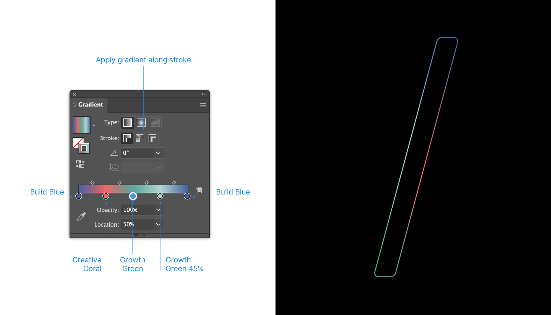
Gradient Stroke
The gradient can be used along a stroke to create a more subtle use of the colour.
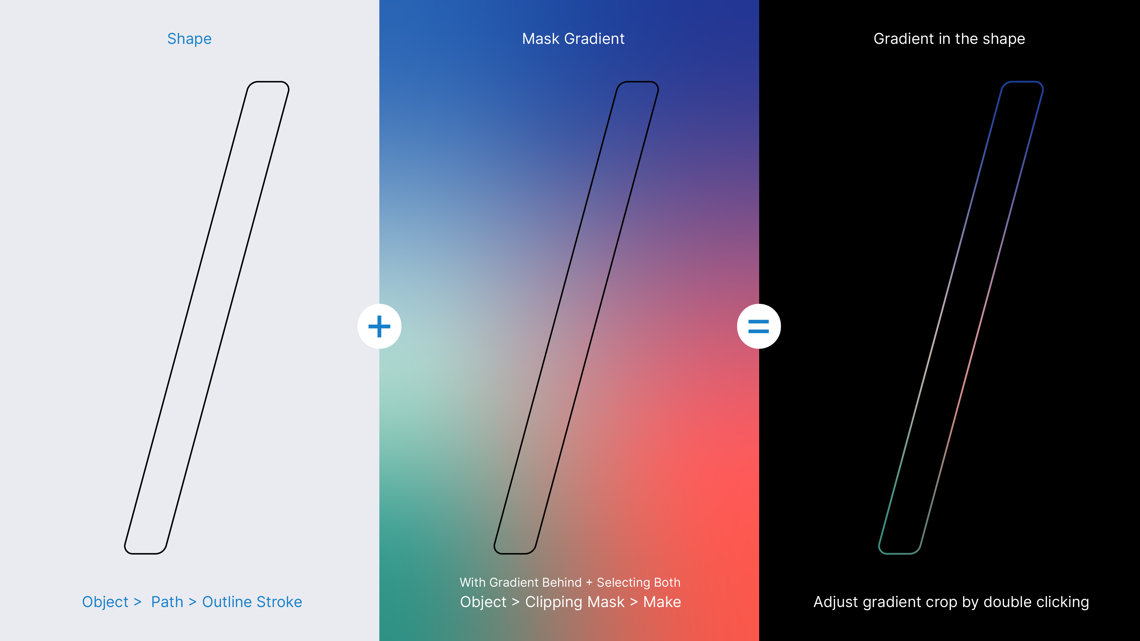
Gradient Mask
The gradient can also be masked in the device shape as an alternative method of adding colour in.
Logo on Colour
The primary versions of the logo should be used where possible.
The mono versions are to be used when printing colours are limited or the background image or colour does not have enough contrast with the primary logo.