Headline Font
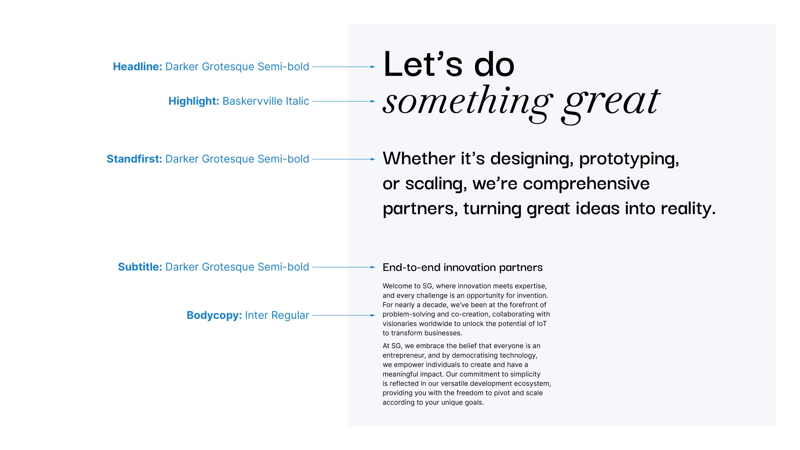
Darker Grotesque, a google font, has been chosen as a headline font of SG.
This font has a modern look with personality, it sits well in the technology sector but brings across a human feel.
The Darker Grotesque font family is available to download from Google.
abcdefghijklmnopqrstuvwxyz
ABCDEFGHIJKLMNOPQRSTUVWXYZ
0123456789
Highlight Font
Baskervville italic is used to highlight words in headlines. This helps to put emphasis on important words and brings character into our typography.
The highlight font does not have to be used and should be used sparingly.
Baskerville Italic is available to download from Google.
abcdefghijklmnopqrstuvwxyz
ABCDEFGHIJKLMNOPQRSTUVWXYZ
0123456789
Body Copy Font
We use Inter as the SG body copy font. Inter is a variable font family carefully crafted and designed for computer screens. Inter features a tall x-height to aid in readability of mixed-case and lower-case text.
We use Inter regular as the main body copy font. Inter Bold or Italic can used used to create emphasis within the body copy.
The Inter font family is available to download from Google.
abcdefghijklmnopqrstuvwxyz
ABCDEFGHIJKLMNOPQRSTUVWXYZ
0123456789
abcdefghijklmnopqrstuvwxyz
ABCDEFGHIJKLMNOPQRSTUVWXYZ
0123456789
abcdefghijklmnopqrstuvwxyz
ABCDEFGHIJKLMNOPQRSTUVWXYZ
0123456789
Typography Hierarchy
We use our various font styles to create typographic hierarchy in our designs. This is to help guide the audience through the levels of content and highligh important information.